Dashboards
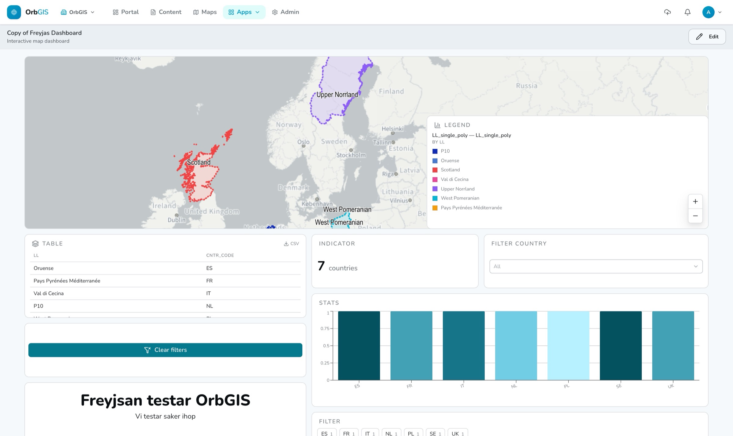
A dashboard is your web map plus the numbers around it — indicators, charts, tables and filters bound to the same layers, with crossfiltering everywhere.
The builder#
The dashboard editor is a full-screen, three-pane workspace: the Add elements palette on the left, the canvas in the middle, and the Properties inspector on the right. The canvas is a 12-column grid — elements snap to it, drag to move, resize from any edge. Undo/redo with Ctrl+Z / Ctrl+Shift+Z; edits autosave as you work.
The nine element types#
| Element | What it does |
|---|---|
| Map | Embeds one of your web maps — the same rendering engine and vector tiles as the map viewer, projection included. Pan/zoom can be locked for kiosk screens. |
| Legend | Symbology for a map element. |
| Indicator | A single aggregated value — Count, Sum, Average, Minimum or Maximum — with formatting, prefix/suffix and an optional caption. |
| Chart | Bar, line or pie, from a category field and an aggregated value. |
| Table | A feature attribute table with chosen columns, paging and sorting. |
| Filter | Lets readers filter — category values as pills or a searchable dropdown, a numeric range, or a date/day range. |
| Action button | Runs one of seven actions: zoom to layer, zoom to selection, reset dashboard, toggle layer, recolor layer, clear filters, open a link. |
| Text | Rich-text content. |
| Image | An image from a file, URL or portal content. |
Binding data#
Data, filter and action elements bind to a map element on the dashboard plus one feature layer inside it — then a field and an aggregation. There is no separate data-source setup and no copy of the data: the dashboard reads the same layers the map does.
Crossfiltering#
Clicking a chart bar, a pie slice or a table row filters the other elements by that value; Filter elements do the same from explicit controls. The map filters client-side on tiles it already has — nothing re-downloads. Data elements re-query with the combined filter. Per source element you choose the scope — filter all elements or only the map — and can have the map zoom to the filtered selection. A chart ignores its own filter so it never collapses to one bar.
Design and themes#
The Design sidesheet applies one of your organization’s themes — chart ramp, fonts, corner radius and spacing switch together — plus per-dashboard overrides and an author byline. Switching themes keeps your overrides.
Preview and publish#
Preview opens the reader view in a new tab. Publish (Publisher or Admin role) puts the dashboard on your organization’s public subdomain — your-org.orbgis.se/your-dashboard — no login, no viewer seats. The publish sidesheet first lists every dataset that becomes publicly readable, so nothing goes public by surprise. Details in Sharing & publishing.