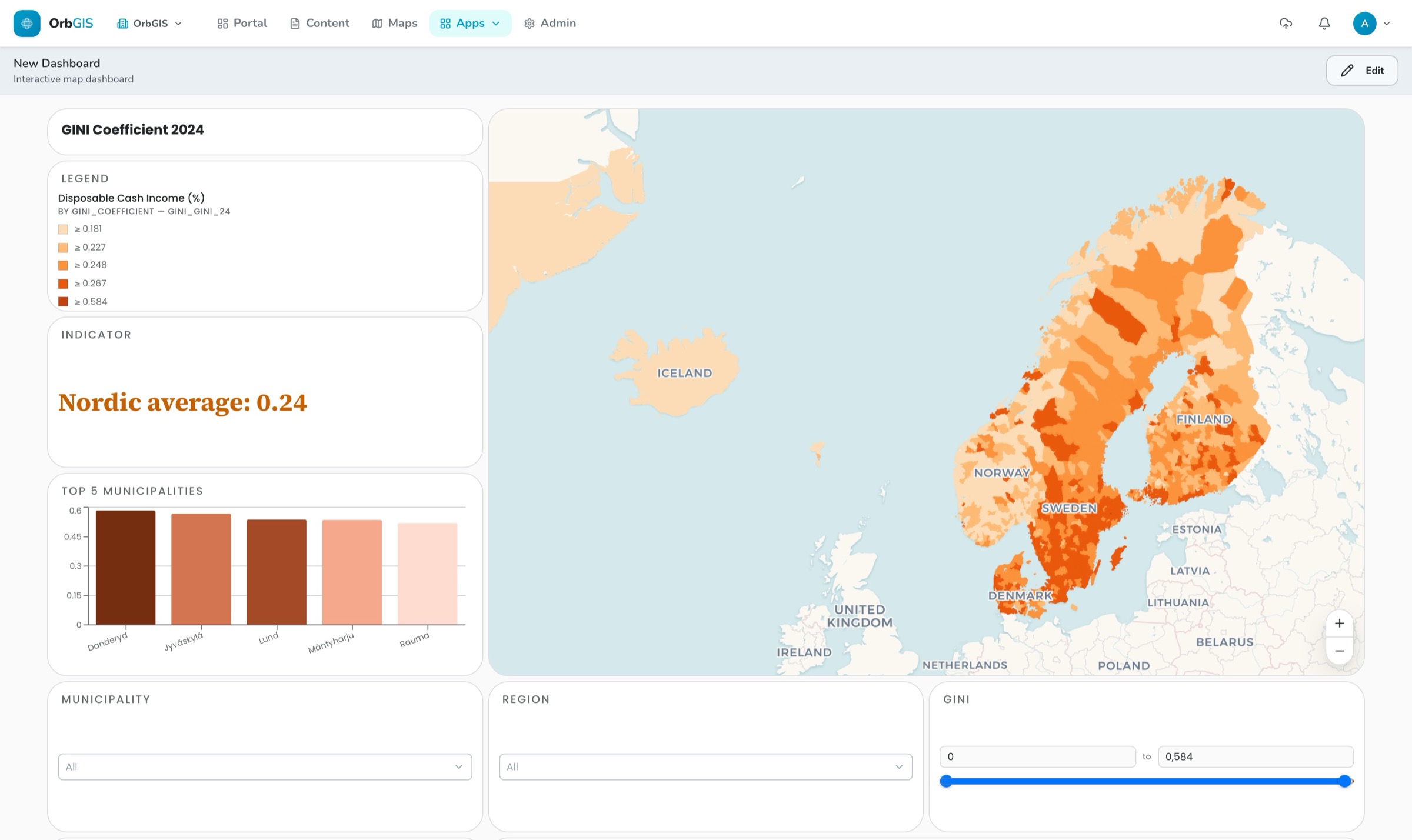
A live dashboard — indicator, top-5 chart, region filters and the real map engine
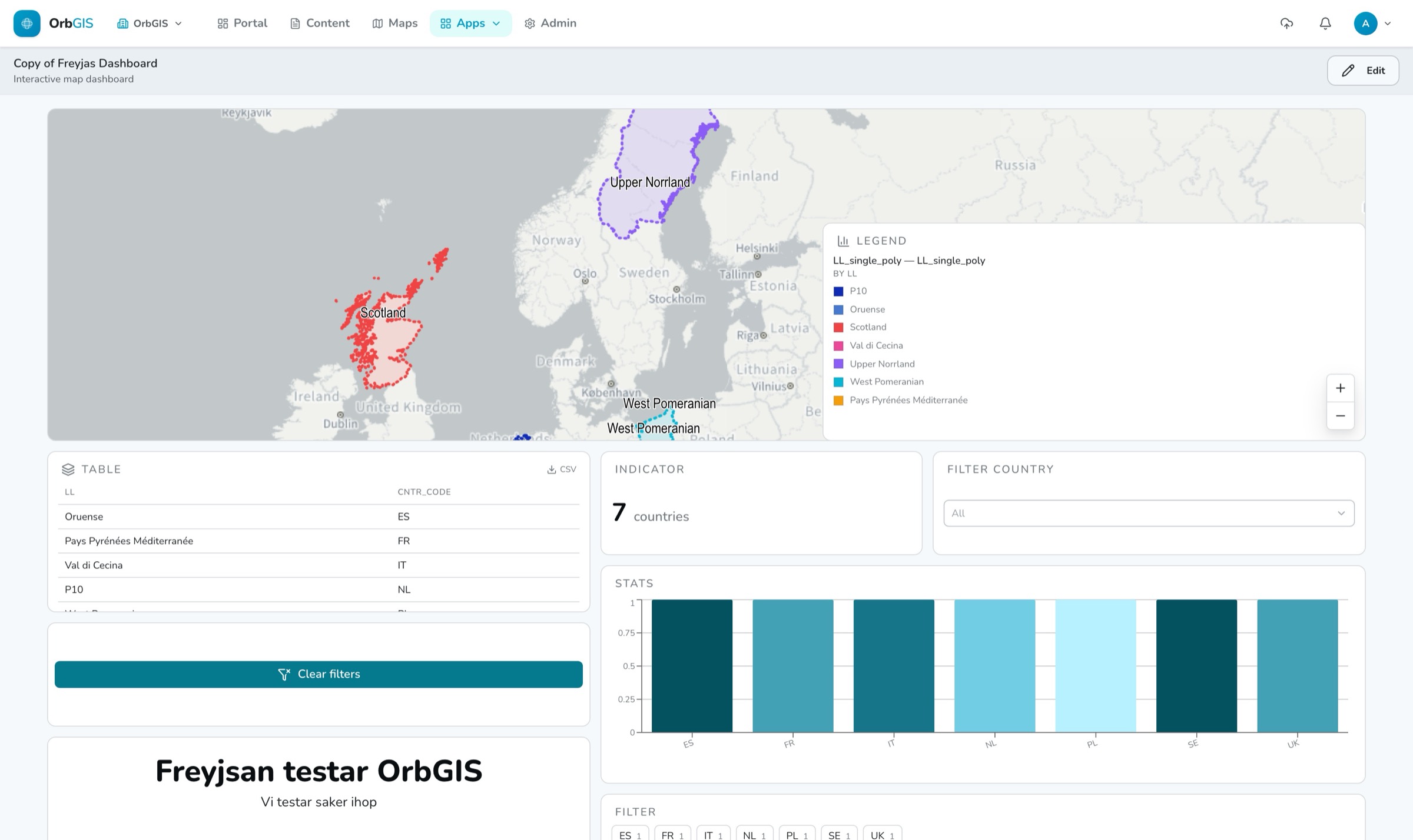
A dashboard is your web map wired together with the statistics from its data and various dashboard-specific tools. Everything can be linked to the map, so interacting with one element is reflected in the others.
A live dashboard — indicator, top-5 chart, region filters and the real map engine
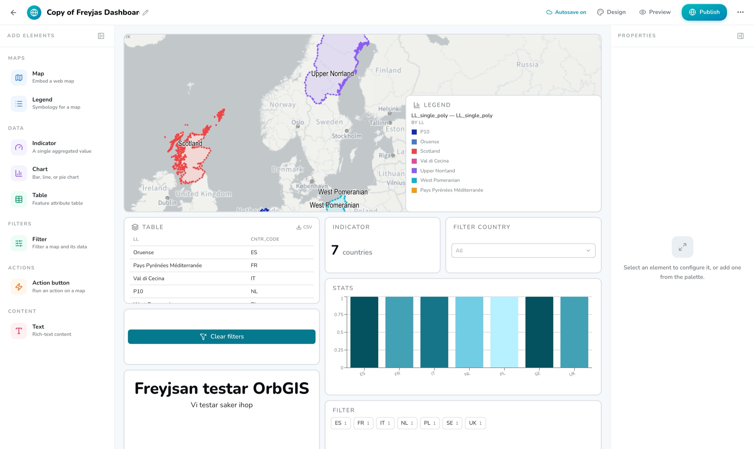
A dashboard in OrbGIS is a blank canvas you fill yourself. With drag-and-drop, you can add maps, indicators, various chart types, table views, a legend, filters, action buttons and text. The map element embeds a web map you already built; every other element binds to one of the layers inside it. No separate data setup, and therefore no copy of the data. You choose whether to gather everything on one static page or build a scrolling dashboard.
Filtering, if you want it to, cascades straight through your entire dashboard. When a user clicks something in, say, a table, or picks an option from a predefined filter, it's reflected across the whole app. If that's not what you want, you can of course also configure a dashboard so that only the map gets filtered.
Dashboards follow your org themes, so with one click you can see colors, fonts and layout adapt. When something needs to look different, it's easy to override specific aspects of the theme — like text color — right in the dashboard builder. Edits autosave about a second after you stop typing. Once your dashboard is ready, publish it. The public page needs no login and no seat, and the publish flow lists every embedded map so you know exactly what goes public.
Map, indicator, chart, table, legend, filter, action button and rich text. Once you've placed an element, fine-tune its size and position either by dragging it directly or through its settings in the right-hand panel.
Click a chart or a table row, or pick an option from a predefined filter, and every bound element updates. Thanks to the engine behind OrbGIS, you never wait for your maps or other elements to re-render — filters take effect instantly.
Category — as pill buttons or a searchable dropdown, single or multi-select. Numeric range with a slider. Date, as a single day or a from–to range.
Built-in functionality gives you a button that, with a single click, can zoom to layer, zoom to selection, reset the view, toggle a layer, recolor a layer, clear filters and open a link. Recolor takes full graduated or categorical symbology, and the legend follows it live.
You get access to exactly the same powerful map engine as in the web map builder. In the element's right-hand panel, you can easily set a custom map view, which layers are visible, and whether the map should be interactive.
Dashboards follow your org's themes, so with one click you can see colors, fonts and layout adapt. Override per dashboard when something needs to look different.
A published dashboard can be reached without logging in to your OrbGIS organization. When you choose to publish, you're warned if any of its content also needs to be shared publicly — and can simply ask OrbGIS to share it correctly right then and there.
Turn a web map into a live operational view: indicators, charts and tables around the map, all bound to the same layers — click a chart and the map filters.
→A dashboard is your web map plus the numbers around it — indicators, charts, tables and filters bound to the same layers, with crossfiltering everywhere.
→Two independent switches govern who sees what: Ownership (Private or Organization) inside your org, and Publishing for the open web — apps only, with a clear exposure check.
→Design your organization’s look once — colors, fonts, chart ramp, radius and spacing — and every dashboard, journey, layout and survey inherits it.
→Datasets are OrbGIS’s working unit: hosted feature layers and attribute tables with typed fields, relationships, statistics — and vector tiles behind every map.
→
No demo call. No sales funnel. Sign up to make your first map.